 NiceSnippets.com
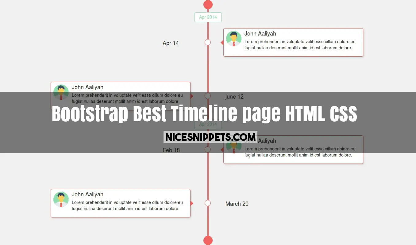
Best timeline page design using html,css and bootstrap
Good looking timeline page design. new timeline page design usign html and css. nicesnippets provide free timeline page design.
you can get code of bootstrap timeline responsive snippet. we give you example of bootstrap timeline vertical , you can simple copy bellow code and use in your project. If it free snippets of bootstrap timeline demo So you have to simple get those bellow code from tab of html, css and js. you simple click on HTML Code then you will get html code timeline page design snippets, click on JS Code tab get code of jquery codd for web design timeline template snippets, same as for CSS Code tab. It's pretty easy and simple example of timeline design html snippet.
<!DOCTYPE html>
<html>
<head>
<link rel="stylesheet" type="text/css" href="https://maxcdn.bootstrapcdn.com/bootstrap/3.3.7/css/bootstrap.min.css">
<link rel="stylesheet" type="text/css" href="https://maxcdn.bootstrapcdn.com/font-awesome/4.7.0/css/font-awesome.min.css">
</head>
<body>
<div class="container">
<div class="row">
<div class="col-md-12 col-sm-12 col-xs-12">
<section class="main-timeline-section">
<div class="timeline-start"></div>
<div class="conference-center-line"></div>
<div class="conference-timeline-content">
<div class="hedding-title">Apr 2014</div>
<div class="timeline-article content-right-container">
<div class="content-date">
<span>Apr 14</span>
</div>
<div class="meta-date"></div>
<div class="content-box">
<div class="image-part">
<img src="/demo/man01.png">
</div>
<div class="title-description">
<h1>John Aaliyah</h1><br>
<p>Lorem prehenderit in voluptate velit esse
cillum dolore eu fugiat nullaa deserunt mollit anim id
est laborum dolore.
</p>
</div>
</div>
</div>
<div class="timeline-article content-left-container">
<div class="content-date">
<span>june 12</span>
</div>
<div class="meta-date"></div>
<div class="content-box">
<div class="image-part">
<img src="/demo/man02.png">
</div>
<div class="title-description">
<h1>John Aaliyah</h1><br>
<p>Lorem prehenderit in voluptate velit esse
cillum dolore eu fugiat nullaa deserunt mollit anim id
est laborum dolore.
</p>
</div>
</div>
</div>
<div class="hedding-title">Apr 2014</div>
<div class="timeline-article content-right-container">
<div class="content-date">
<span>Feb 18</span>
</div>
<div class="meta-date"></div>
<div class="content-box">
<div class="image-part">
<img src="/demo/man03.png">
</div>
<div class="title-description">
<h1>John Aaliyah</h1><br>
<p>Lorem prehenderit in voluptate velit esse
cillum dolore eu fugiat nullaa deserunt mollit anim id
est laborum dolore.
</p>
</div>
</div>
</div>
<div class="timeline-article content-left-container">
<div class="content-date">
<span>March 20</span>
</div>
<div class="meta-date"></div>
<div class="content-box">
<div class="image-part">
<img src="/demo/man04.png">
</div>
<div class="title-description">
<h1>John Aaliyah</h1><br>
<p>Lorem prehenderit in voluptate velit esse
cillum dolore eu fugiat nullaa deserunt mollit anim id
est laborum dolore.
</p>
</div>
</div>
</div>
</div>
<div class="timeline-end"></div>
</section>
</div>
</div>
</div>
</body>
</html>
body{
background-color: #f1f1f1;
}
.main-timeline-section{
position: relative;
width: 100%;
margin:auto;
}
.main-timeline-section .timeline-start,
.main-timeline-section .timeline-end {
background: #F2635F;
border-radius:100px;
margin: 0 auto;
width:30px;
height:30px;
}
.hedding-title{
position:relative;
left:50%;
top:-30px;
transform: translateX(-50%);
border-radius: 5px;
background-color:#fff;
color:#90DFAA;
border:1px solid #90DFAA;
padding:5px 15px;
float: left;
}
.main-timeline-section .conference-center-line {
position: absolute;
width: 4px;
height:100%;
top: 0;
left:50%;
margin-left: -2px;
background:#F2635F;
z-index: -1;
}
.timeline-article{
width:100%;
position:relative;
margin:40px 0px;
min-height: 135px;
z-index: 0;
}
.timeline-article .content-date{
position: absolute;
top:33%;
left:37%;
font-size:18px;
transform: translateY(50%);
}
.timeline-article .meta-date {
position: absolute;
top:50%;
left: 50%;
width:20px;
height:20px;
transform: translateY(-50%);
margin-left: -11px;
border-radius: 100%;
background:#fff;
border:1px solid #F2635F;
}
.timeline-article .content-box{
position:absolute;
box-shadow: 2px 2px 4px 0px #c1c1c1;
border:1px solid #F2635F;
border-radius: 5px;
background-color: #fff;
width:40%;
top:50%;
transform: translateY(-50%);
padding:8px;
left:50%;
margin-left:50px;
}
.content-left-container .content-box{
left:5%;
margin-left: 0px;
}
.content-left-container .content-date{
left:55%;
}
.content-right-container .content-box:before{
content: " ";
position:absolute;
left:-10px;
top:40%;
transform: translateX(-50%);
border:10px solid transparent;
border-right-color:#F2635F;
display:block;
}
.content-left-container .content-box:before{
content: " ";
position:absolute;
top:40%;
right:-30px;
transform: translateX(-50%);
border:10px solid transparent;
border-left-color:#F2635F;
}
.timeline-article .image-part img{
height: 50px;
width: 50px;
float:left;
margin-right:10px;
}
.timeline-article .title-description h1{
margin:0px;
font-size: 18px;
float:left;
}
.timeline-article .title-description p{
padding-top:5px;
font-size:14px;
}
@media (max-width: 460px){
body{
display: none;
}
}