Here We explain how to work bootstrap 4 column structure.
".col-" class work with screen resolution less than 576px.
".col-sm-" class work with screen resolution less than and equal to 576px.
".col-md-" class work with screen resolution less than and equal to 768px.
".col-lg-" class work with screen resolution less than and equal to 992px.
".col-xl-" class work with screen resolution greater than and equal to 1200px.
all column class working like this and you can easaly use in your project.
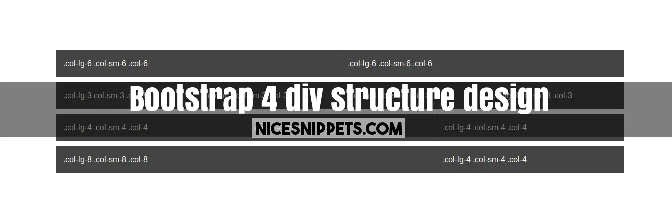
you can get code of bootstrap 4 div structure snippet. we give you example of bootstrap 4 columns grid , you can simple copy bellow code and use in your project. If it free snippets of bootstrap 4 col offset So you have to simple get those bellow code from tab of html, css and js. you simple click on HTML Code then you will get html code bootstrap 4 content snippets, click on JS Code tab get code of jquery codd for bootstrap 4 layout snippets, same as for CSS Code tab. It's pretty easy and simple example of bootstrap 4 grid example snippet.
<!DOCTYPE html>
<html>
<head>
<link rel="stylesheet" href="https://maxcdn.bootstrapcdn.com/bootstrap/4.0.0-beta.2/css/bootstrap.min.css" integrity="sha384-PsH8R72JQ3SOdhVi3uxftmaW6Vc51MKb0q5P2rRUpPvrszuE4W1povHYgTpBfshb" crossorigin="anonymous">
</head>
<body>
<div class="container bg-color">
<div class="row">
<div class="col-lg-6 col-sm-6 col-6">.col-lg-6 .col-sm-6 .col-6</div>
<div class="col-lg-6 col-sm-6 col-6">.col-lg-6 .col-sm-6 .col-6</div>
</div>
<div class="row">
<div class="col-lg-3 col-sm-3 col-3">.col-lg-3 col-sm-3 .col-3</div>
<div class="col-lg-3 col-sm-3 col-3">.col-lg-3 col-sm-3 .col-3</div>
<div class="col-lg-3 col-sm-3 col-3">.col-lg-3 col-sm-3 .col-3</div>
<div class="col-lg-3 col-sm-3 col-3">.col-lg-3 col-sm-3 .col-3</div>
</div>
<div class="row">
<div class="col-lg-4 col-sm-4 col-4">.col-lg-4 .col-sm-4 .col-4</div>
<div class="col-lg-4 col-sm-4 col-4">.col-lg-4 .col-sm-4 .col-4</div>
<div class="col-lg-4 col-sm-4 col-4">.col-lg-4 .col-sm-4 .col-4</div>
</div>
<div class="row">
<div class="col-lg-8 col-sm-8 col-8">.col-lg-8 .col-sm-8 .col-8</div>
<div class="col-lg-4 col-sm-4 col-4">.col-lg-4 .col-sm-4 .col-4</div>
</div>
</div>
</body>
</html>
body{
background-color: #EFF8FE;
padding-top: 30px;
}
.bg-color .row div{
background-color: #444;
margin-bottom: 10px;
padding: 15px;
border-right:1px solid #fff;
color: #fff;
}
 NiceSnippets.com