 NiceSnippets.com
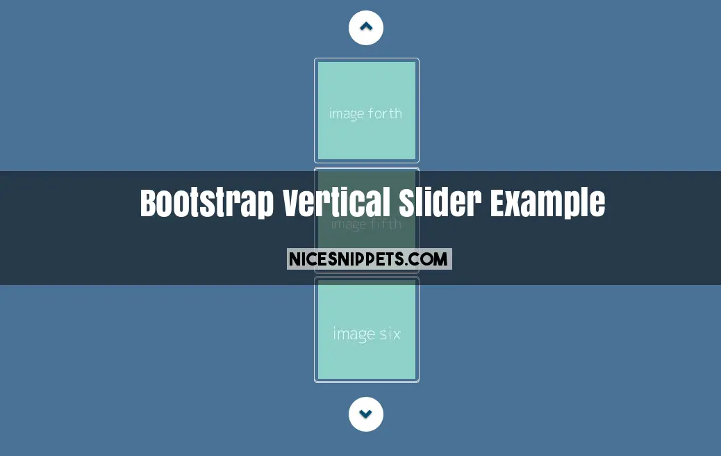
Bootstrap Vertical Slider Example
we are giving you carousel vertical slider demo with boostrap. this is thumbnail image vertical slider. in this slider we are also display next previous button. you can use this slider in sidebar. and also use in footer. this vertical slider support all the browser. this is fully responsive slider design.
We allows to free snippets of bootstrap vertical thumbnail carousel , you can download full code of bootstrap vertical carousel multiple items layout. Here in this post i will give you example of vertical carousel bootstrap 4 snippet and you will get simple code of html, css and jquery. In vertical text slider bootstrap snippet i give you three tab with html, css and js, you can easily get code of bootstrap multiple image slider layout.
<!DOCTYPE html>
<html>
<head>
<script src="https://ajax.googleapis.com/ajax/libs/jquery/3.2.1/jquery.min.js"></script>
<script src="https://maxcdn.bootstrapcdn.com/bootstrap/3.3.7/js/bootstrap.min.js"></script>
<link rel="stylesheet" type="text/css" href="https://maxcdn.bootstrapcdn.com/bootstrap/3.3.7/css/bootstrap.min.css">
<link rel="stylesheet" type="text/css" href="custom.css">
</head>
<body>
<div class="container">
<div class="col-md-offset-5 col-md-2 col-sm-2 col-xs-12">
<div id="carousel-pager" class="carousel slide " data-ride="carousel" data-interval="1000">
<div class="carousel-inner vertical">
<div class="active item">
<img src="https://dummyimage.com/140x140/8DD1C8/fff.jpg&text=image one" class="img-responsive" data-target="#carousel-main" data-slide-to="0">
</div>
<div class="item">
<img src="https://dummyimage.com/140x140/8DD1C8/fff.jpg&text=image second" class="img-responsive" data-target="#carousel-main" data-slide-to="1">
</div>
<div class="item">
<img src="https://dummyimage.com/140x140/8DD1C8/fff.jpg&text=image third" class="img-responsive" data-target="#carousel-main" data-slide-to="2">
</div>
<div class="item">
<img src="https://dummyimage.com/140x140/8DD1C8/fff.jpg&text=image forth" class="img-responsive" data-target="#carousel-main" data-slide-to="2">
</div>
<div class="item">
<img src="https://dummyimage.com/140x140/8DD1C8/fff.jpg&text=image fifth" class="img-responsive" data-target="#carousel-main" data-slide-to="2">
</div>
<div class="item">
<img src="https://dummyimage.com/140x140/8DD1C8/fff.jpg&text=image six" class="img-responsive" data-target="#carousel-main" data-slide-to="2">
</div>
</div>
<a class="left carousel-control" href="#carousel-pager" role="button" data-slide="prev">
<span class="glyphicon glyphicon-chevron-up" aria-hidden="true"></span>
<span class="sr-only">Previous</span>
</a>
<a class="right carousel-control" href="#carousel-pager" role="button" data-slide="next">
<span class="glyphicon glyphicon-chevron-down" aria-hidden="true"></span>
<span class="sr-only">Next</span>
</a>
</div>
</div>
</div>
</body>
</html>
body{
background-color: #4A7296;
}
.carousel-inner.vertical > .item {
-webkit-transition: .10s ease-in-out bottom;
-moz-transition: .10s ease-in-out bottom;
-o-transition: .10s ease-in-out bottom;
transition: .10s ease-in-out bottom;
}
@media all and (transform-3d),
(-webkit-transform-3d) {
.carousel-inner.vertical > .item {
-webkit-transition:-webkit-transform .6s ease-in-out;
-moz-transition:-webkit-transform .6s ease-in-out;
-o-transition:-o-transform .6s ease-in-out;
transition:transform .6s ease-in-out;
-webkit-backface-visibility:hidden;
-moz-backface-visibility:hidden;
backface-visibility:hidden;
-webkit-perspective:1000;
-moz-perspective:1000;
}
.carousel-inner.vertical > .item.next,
.carousel-inner.vertical > .item.active.right {
-webkit-transform: translate3d(0, 33.33%, 0);
-moz-transform: translate3d(0, 33.33%, 0);
transform: translate3d(0, 33.33%, 0);
top:0px;
}
.carousel-inner.vertical > .item.prev,
.carousel-inner.vertical > .item.active.left {
-webkit-transform: translate3d(0, -33.33%, 0);
-moz-transform: translate3d(0, -33.33%, 0);
transform: translate3d(0, -33.33%, 0);
top: 0px;
}
.carousel-inner.vertical > .item.next.left,
.carousel-inner.vertical > .item.prev.right,
.carousel-inner.vertical > .item.active {
-webkit-transform: translate3d(0, 0, 0);
-moz-transform: translate3d(0, 0, 0);
transform: translate3d(0, 0, 0);
top:0px;
}
}
.carousel-inner.vertical > .next,
.carousel-inner.vertical > .prev {
height: 100%;
width: auto;
}
#carousel-pager .carousel-control.left,#carousel-pager .carousel-control.right{
width:50px;
height:50px;
border-radius: 50%;
background:#FFF;
opacity: 1;
position: absolute;
top:-65px;
left:50%;
transform: translateX(-50%);
}
#carousel-pager .carousel-control.right {
top:unset;
bottom: -65px;
left:50%;
transform: translateX(-50%);
}
.left .glyphicon,.right .glyphicon{
position:absolute;
top:13px;
left:16px;
color:#004C70;
}
.right .glyphicon{
top:16px;
left:15px;
}
.item img{
border:1px solid #e2e2e2;
padding: 5px;
border-radius:5px;
margin:5px;
}
.carousel{
margin-top:80px;
}
$('.carousel .vertical .item').each(function(){
var next = $(this).next();
if (!next.length) {
next = $(this).siblings(':first');
}
next.children(':first-child').clone().appendTo($(this));
for (var i=1;i<2;i++) {
next=next.next();
if (!next.length) {
next = $(this).siblings(':first');
}
next.children(':first-child').clone().appendTo($(this));
}
});